CSS3 2D转换
关键字:transform
- 移动:沿着x,y轴移动,不会影响盒子的位置,对行内元素没有效果
div {width: 100px;height: 100px;background-color: rebeccapurple;transform: translate(100px,100px);transform: translateX(100px);transform: translateY(100px);}
- 旋转 rotate
div {width: 200px;height: 200px;background-color: aqua;/* transform: rotate(30deg); */transition: all 1s;}div:hover {transform: rotate(360deg);}- 2d转换中心点 transform-origin
div {width: 200px;height: 200px;border: 1px solid #000;transition: all 1s;transform-origin: left bottom;transform-origin: 300px 300px;}div:hover {transform: rotate(220deg)}
- 缩放 scale:可以设置转换中心点,不影响其他盒子
p {width: 200px;height: 200px;background-color: red;} p:hover {transform: scale(2,1);transform: scaleX(3);transform: scale(2);transform: scale(0.5);}
- 转换综合写法: 以空格隔开,顺序会影响效果,最好位移在前
li:hover {transform: translate(0px,10px) rotate(90deg) scale(1.2);}
CSS3 动画
关键字: animation
- 用keyframes定义动画并使用
@keyframes move {0%{transform: translateX(0px);}100%{transform: translateX(1000px);}}div {width: 200px;height: 200px;background-color: red;animation: move 2s ;}
动画相关属性:
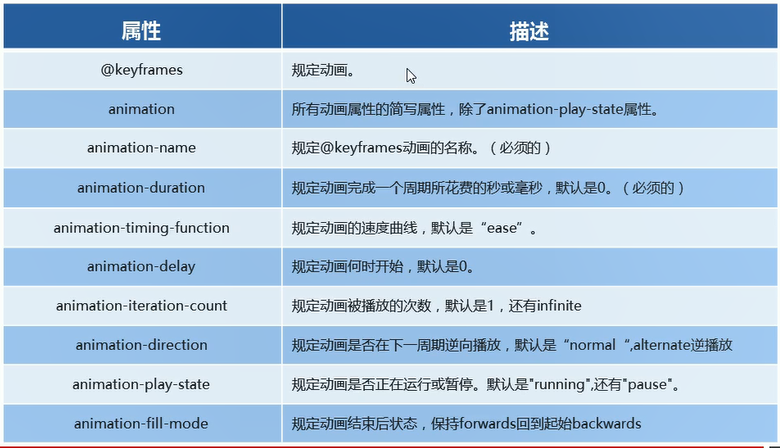
- 使用多个状态和属性
@keyframes move {from {transform: translateX(0px);}50% {transform: translate(500px, 200px);}60% {transform: translateX(1000px);}to {transform: translateX(0);}}div {width: 200px;height: 200px;background-color: red;animation: move 2s ;animation-iteration-count: infinite;animation-direction: alternate;/* animation-fill-mode: forwards; */}div:hover {animation-play-state: paused;}
CSS3 3D转换
-
透视 perspective :写到被观察元素的父盒子上;
-
移动: translate3d:
body {perspective: 105px;}div {width: 100px;height: 100px;background-color: #663399;transform: translate3d(100px,100px,10px);}
- 旋转 rotate3d:
body {perspective: 300px;}img {display: block;margin: 20px 200px;width: 200px;transition: all 2s;}img:hover {transform: rotateX(360deg);transform: rotateY(180deg);transform: rotateZ(90deg) ;transform: rotate3d(1,1,0,270deg);}
- 3d呈现 transform-style:
 body {perspective: 300px;}
box {position: relative;width: 200px;height: 200px;margin: 0 auto;transform-style: preserve-3d;transition:  all 2s;}.box:hover {transform:  rotateY(180deg);}.box div {position: absolute;top:0;left: 0;width: 100%;height: 100%;background-color: aqua;}.box div:last-child {background-color: blue;transform: rotateX(60deg);}