QML入门之创建可重用的组件(一)
我们在日常开发中都会封装一些组件以便于项目内重复利用。QML创建可重用组件一般有两种方法。
- 自定义Item
- 使用Component创建自定义组件
自定义Item
以一个自定义按钮举例:
import QtQuick 2.12Rectangle {id: root// 自定义属性property string btnDis: qsTr("button")property string pressedColor: "yellow"property string normalColor: "gray"property int btnw: 80property int btnh: 20signal btnClickedradius: 4width: disStr.width> root.width? disStr.width + 8 : btnwheight: btnhcolor: mouseArea.pressed? pressedColor : normalColorText {id: disStranchors.centerIn: parenttext: btnDis}MouseArea {id: mouseAreaanchors.fill: parentonClicked: root.btnClicked()}
}
然后再主文件直接使用元素即可:
import QtQuick 2.12
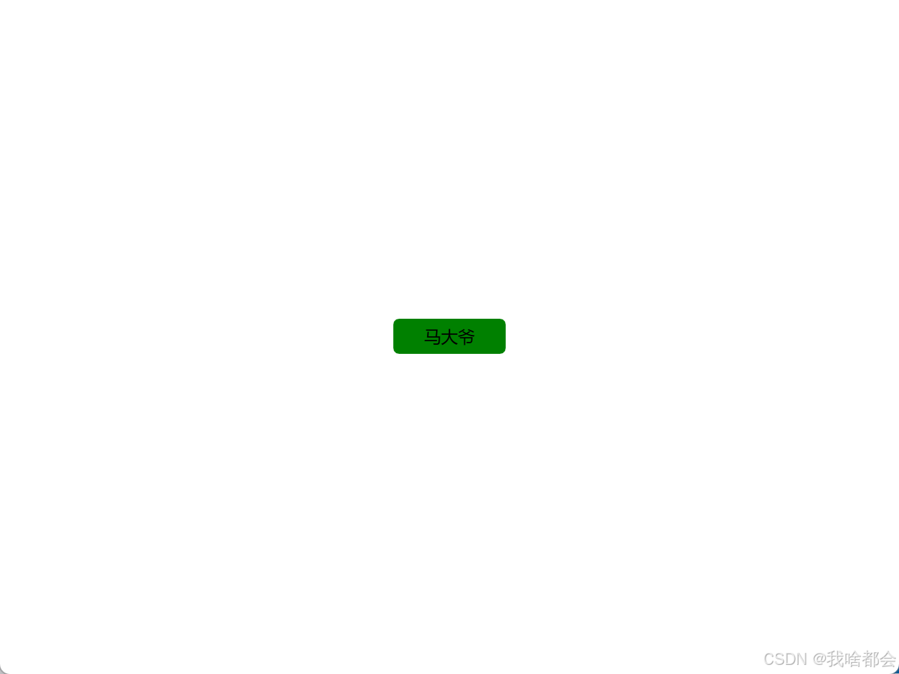
import QtQuick.Window 2.12Window {id:rootvisible: truewidth: 640height: 480title: qsTr("简单窗口")RadiusButton {id: loginBtnanchors.centerIn: parentbtnDis: qsTr("马大爷")btnh: 25pressedColor: "green"onBtnClicked: {console.log(qsTr("按钮点击了"))} }
}
注意:
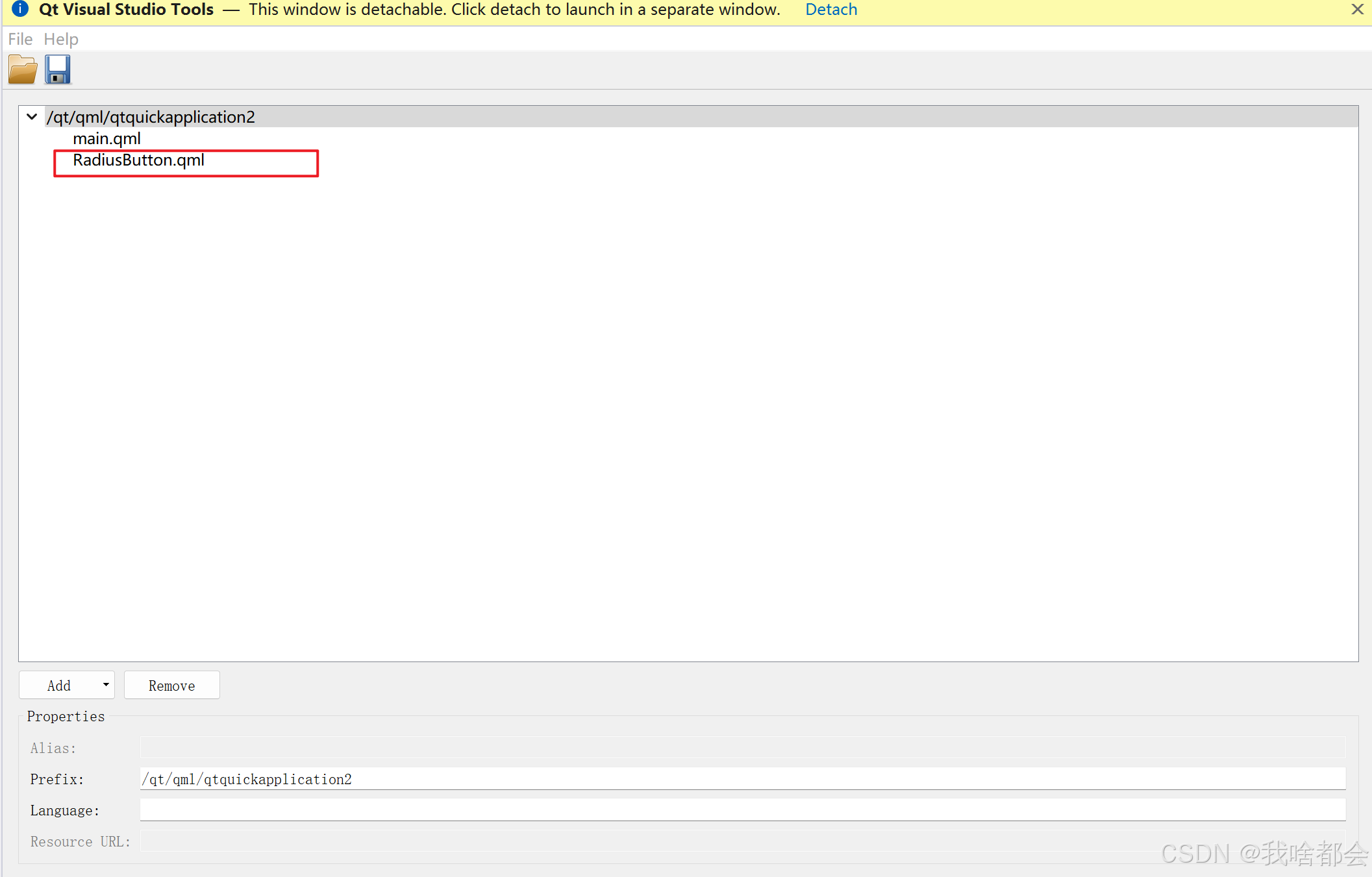
如果出现找不到组件,则检查下是否将组件添加到了qrc中,如下图:
如果并不是在根目录下则需要import相应的文件夹,如下:
 在main.qml中 import "qrc:/ui"即可。
通常,自定义组件时我们会以一个Item作为根节点,可以防止用户通过基本属性改变我们设计的按钮的属性色。修改之后为:
import QtQuick 2.12
Item {id: root// 自定义属性property string btnDis: qsTr("button")property string pressedColor: "yellow"property string normalColor: "gray"property int btnw: 80property int btnh: 20signal btnClickedwidth: rect.widthheight: rect.heightRectangle {id: rectanchors.fill: parentradius: 4width: disStr.width> rect.width? disStr.width + 8 : btnwheight: btnhcolor: mouseArea.pressed? pressedColor : normalColorText {id: disStranchors.centerIn: parenttext: btnDis}MouseArea {id: mouseAreaanchors.fill: parentonClicked: root.btnClicked()}}
}
其中,disStr.width> rect.width? disStr.width + 8 : btnw 即自适应按钮文字大小。